Swiss font legend Adrian Frutiger dies
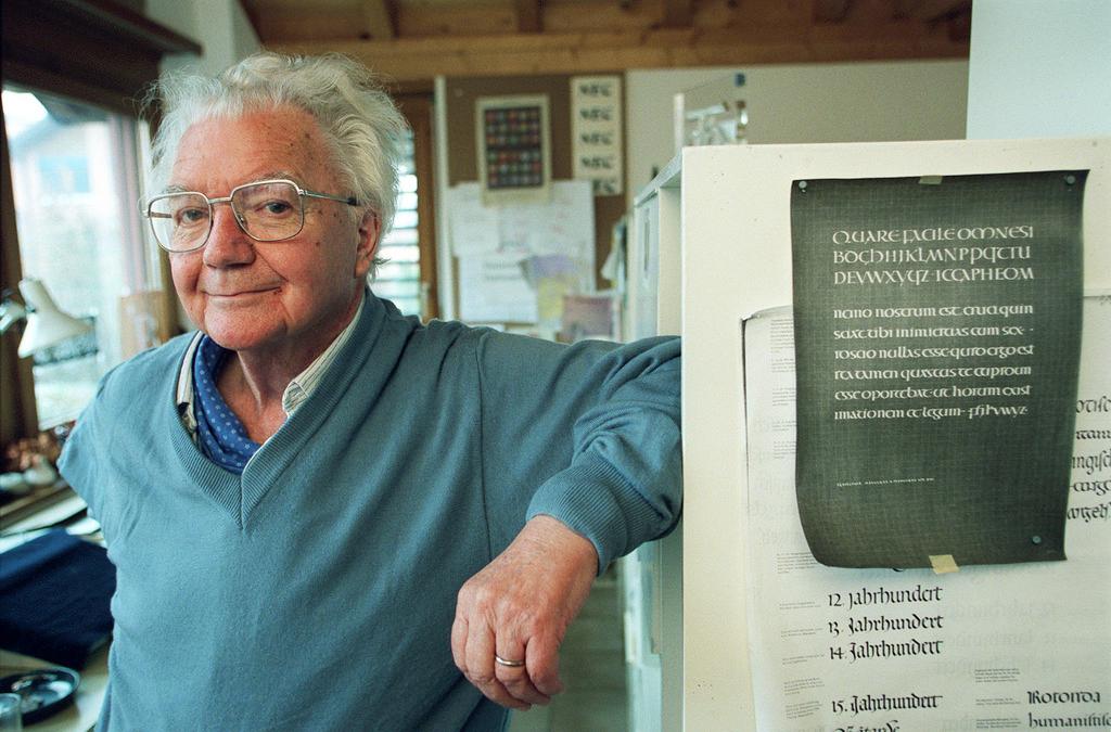
The internationally renowned Bernese designer who created the famous Univers typeface passed away on September 12 in Bern at the age of 87.
He was one of the few typographers who worked with hot metal, photographic and digital typesetting during his long career. Besides his well-known Univers family of sans serif typefaces, Frutiger designed over 50 other fonts like Roissy, Avenir, Centennial, Egyptienne, Glyphia, Serifa and Versailles. He was also the man behind OCR-B, the standard alphabet for optical character recognition.
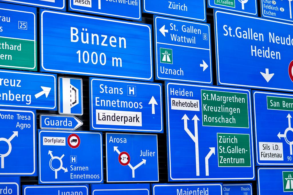
In Switzerland, he is best known for ASTRA-Frutiger, which has been used for Swiss road signs since 2003. ASTRA-Frutiger was designed to give the eye a better hold and be clear and highly legible at a distance or using small text sizes. His skills were not just limited to road users. Air and rail travellers also benefitted from his genius for combining legibility with style. The Frutiger typeface welcomes visitors to the Charles de Gaulle airport in Paris and the city’s metro uses his Métro alphabet on its signs.
More
Switzerland: still a font of creativity
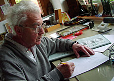
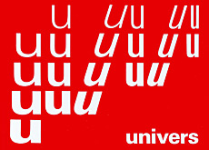
Frutiger was born in 1928 in Unterseen in the Bernese Oberland region. After an apprenticeship in Interlaken and a stint in the Zurich school of art, he was employed by French type foundry Deberny & Peignot as an artistic director in 1952. He soon made his mark with his Méridien font and later came up with his most acclaimed and recognized typeface: Univers.
Univers was one of the first breakthroughs of the new system of phototypesetting, which soon supplanted the old and expensive method of casting a font in lead. It offered a whole set of variations to the blossoming global advertising industry which helped make it enormously popular. Frutiger profited from the advertising boom by creating his own studio in 1960 and working for clients such as Air France, IBM and the Swiss Post.
Frutiger has written many books on his craft, such as Signs and Symbols, Development of Western Type, Typografie and Geometry of Feelings. An anthology of his work called Adrian Frutiger – Typefaces. The Complete Works was published in 2008.
His contributions to his field were recognised via several prestigious awards such as the French Chevalier de l’Ordre des Arts et Lettres, the Gutenburg Prize of the city of Mainz, and the Medal of the Type Directors Club of New York. In 2009, he was inducted into the European Design Hall of Fame.

In compliance with the JTI standards
More: SWI swissinfo.ch certified by the Journalism Trust Initiative

You can find an overview of ongoing debates with our journalists here. Please join us!
If you want to start a conversation about a topic raised in this article or want to report factual errors, email us at english@swissinfo.ch.