‘The world is changing – and so is graphic design’
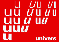
Matthieu Cortat designed the font Basetica in 2013 as part of the Open Switzerland project for BaseGVA, the Geneva branch of an international network of creative studios.

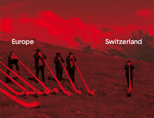
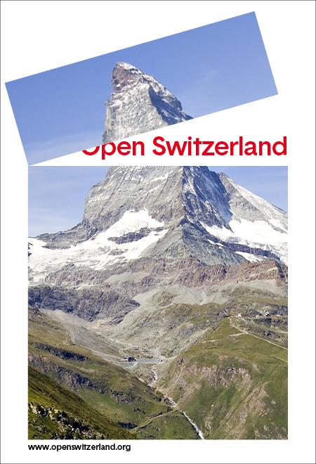
Open Switzerland invites the public to create their own postersExternal link on the theme of Swiss identity. They have a choice of Swiss-related background images onto which they write a caption, choosing the font size, colour and alignment.
More
How open is Switzerland to the rest of the world?
Cortat, 32, tells swissinfo.ch by email about the process of creating a new font and the technical challenges of “waking up” the iconic Helvetica, as well as his own relationship towards Switzerland.
swissinfo.ch: The Open Switzerland website says Basetica wants to be a ‘Helvetica for 2013 – open minded, neat and modern. Sometimes a bit raw, but always clean and discreet. Basetica ironically recalls the Swiss International Style of the 50s and 60s’. How do you make a typeface that is ‘a bit raw, but always clean and discreet’?
Matthieu Cortat: Being aware of the major role of typography in the Swiss Style, BaseGVA and I talked about how we could create a font which would be faithful to the precision of Swiss typography, to its discretion and fairness.
The great age of the Swiss Style, in the 1950s and 1960s, produced functional and well-cut typefaces. It did this so well that the legitimate pride of Switzerland for this golden age seems sometimes to inhibit creativity: ‘we have the best corporate identity in the world. Why change it?’ But the world is changing. And so is graphic design. And typography. Without losing the qualities of its glorious ancestors, Basetica wants to be the rambunctious kid of the family. But a Swiss family – he’s the one who crosses the street without using the pedestrian crossing!
swissinfo.ch: How does Basetica ‘ironically recall’ the Swiss International Style of the 1950s and 1960s?
M.C.: I think the Swiss typefaces of the 1950s and 1960s are, above all, earnest: letters are modernist but without the dogmatic whims of the Bauhaus, the underlying traditionalism of British typography and the calligraphic traditions of the Netherlands.
They were made by honest, respectable men with an ordered and methodical spirit, working fervently to build a pragmatic graphic design in which almost nothing is left to chance or to frivolity. It’s as clean as a Swiss landscape, decent as a Sunday sermon… and equally boring!
swissinfo.ch: How does Basetica differ from Helvetica?
M.C.: By little touches, I wanted to pinch Helvetica and wake it up. For example, ‘a’ is quite similar but the rounded lower case (b, c, d, e, o, p, q) are close to the form of a circle. The ‘j’ does not work up for its descender, as does ‘t’, a simple cross with an oblique [sloping] stress on its upper stem.

Its counters are a bit larger. But the loss of horizontal space is balanced by a very large x-heightExternal link which allows Basetica to be set in smaller size for an equal legibility.
The question of the x-height was a major point of the project from the beginning. With the influence of 1970s and 1980s ITC [International Typeface Corporation] typefaces and all the fonts designed for newspapers over the past 20 years, we are used today to smaller ascenders and descenders. I think it’s a general characteristic of typography at the beginning of the 21st century. [Compare this with a sans-serif font with a very small x-height such as FuturaExternal link (Germany, 1927).]
There is more rhythm in Basetica than in Helvetica: some letters are distinctively narrow, for example ‘f r s t’. In capitals, I wondered why ‘B’, ‘E’ or ‘L’ were so large in Helvetica, and I chose to equalise mine. Why not have a 45 degree angle in the tail of the ‘Q’? Is it absolutely necessary to have a curve at the lower part of ‘y’?

swissinfo.ch: What were your biggest influences in this job – and in general?
M.C.: I mainly took inspiration from internal moods. Existing fonts are also a big influence, of course: Helvetica and the Swiss tradition, and the Swiss current typographic scene, too. Above all, I think we had a good dialogue with BaseGVA. They explained what they wanted; we shared ideas, sketches. And so the font gradually emerged.
swissinfo.ch: What’s the biggest challenge in creating a new typeface?

M.C.: It would take dozens of pages to answer this question! What’s the biggest challenge in creating a new piece of clothing? A new chair? A new car? A new building?
It’s about creation in general. How can we be original in a globalised world which gives us thousands of pictures taken around the world every day? How do new technologies modify the creation of letterforms? And their perceptions? How can we insert ourselves in the history of typography without having the ingenuity to think that we could be revolutionary, or even avant-garde, but also without repeating the past?
swissinfo.ch: How do you see Switzerland today?
M.C.: I’m Swiss but I’ve lived in France for ten years, looking at Switzerland from abroad. Some aspects of Swiss life now appear to me surprising, or sometimes irrational, and I’m often baffled when I try to explain to my French friends the Swiss political system and the 26 different cantonal parliaments and school systems…
The graphic identity of Switzerland is made of decades of tourism, watch exports, precision engineering (and tax evasion!). This image was pretty much the same already in the 1960s. Even if I don’t live in Switzerland, I know that all of those clichés are partly true, but also that there are many other things in this country: energy, ideas and willingness to change things. Basetica does this – in the Swiss way of course, by small steps. Could you imagine a revolution in Switzerland?
Glossary
A typeface (also known as font family) is a set of one or more fonts each composed of glyphs (characters) that share common design features. In digital typography, the font is a digital file which contains the typeface; the typeface is what you see.
Each font of a typeface has specific characteristics, including weight, style, stroke width, stroke contrast, italicisation, ornamentation (and formerly size, in metal fonts). For example, the Neue Helvetica Complete Family PackExternal link on fonts.com comprises 51 fonts.
Fonts are either serif (rhymes with sheriff, also known as “Roman”) or sans-serif (rhymes with bans sheriff, also known as “Grotesque” or “Gothic”). A serif is a short line or finishing stroke that crosses or projects from stems or strokes in a character.
A more detailed glossaryExternal link and an introduction to typographyExternal link.
Matthieu Cortat
Born in 1982 in Delémont, canton Jura, Matthieu Cortat is a type and graphic designer.
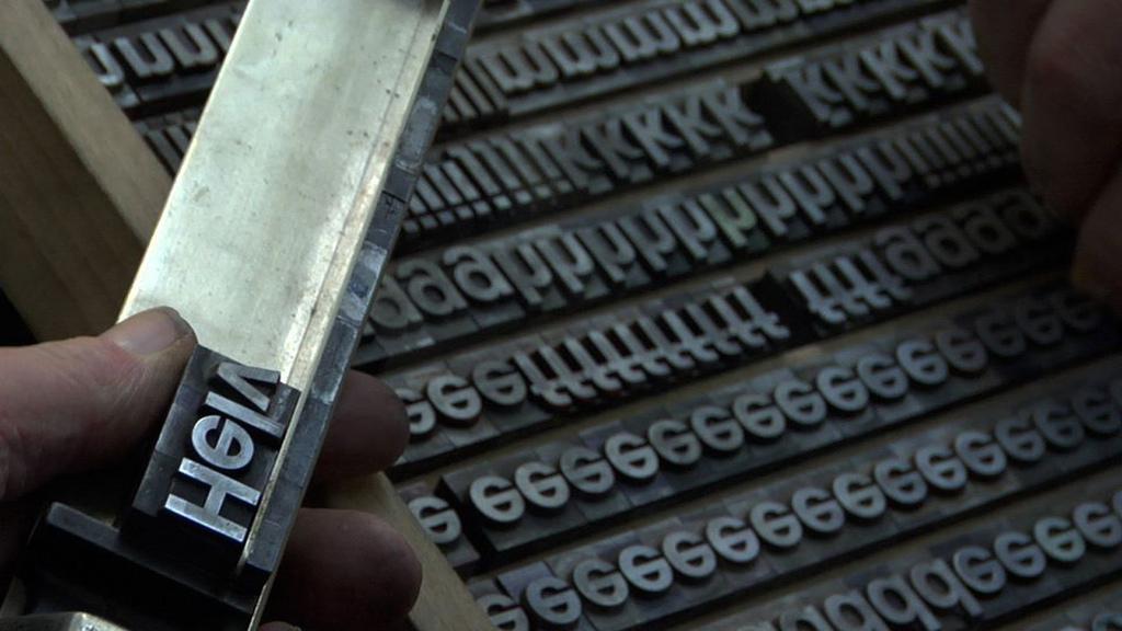
He graduated from the University of Art and Design Lausanne (ECAL) and the Atelier national de Recherche typographique (ANRT) in Nancy, France. Now living in Lyon, he creates new typefaces, but also works with several publishers as a typographer and offers regular guided tours of the Lyon Printing Museum.
Within the framework of this latter institution, he has set up the Corpus Typographique Français, which collects all typefaces designed in France between 1850 and today.

In compliance with the JTI standards
More: SWI swissinfo.ch certified by the Journalism Trust Initiative
You can find an overview of ongoing debates with our journalists here. Please join us!
If you want to start a conversation about a topic raised in this article or want to report factual errors, email us at english@swissinfo.ch.