Swiss font designer reveals the fashion of words
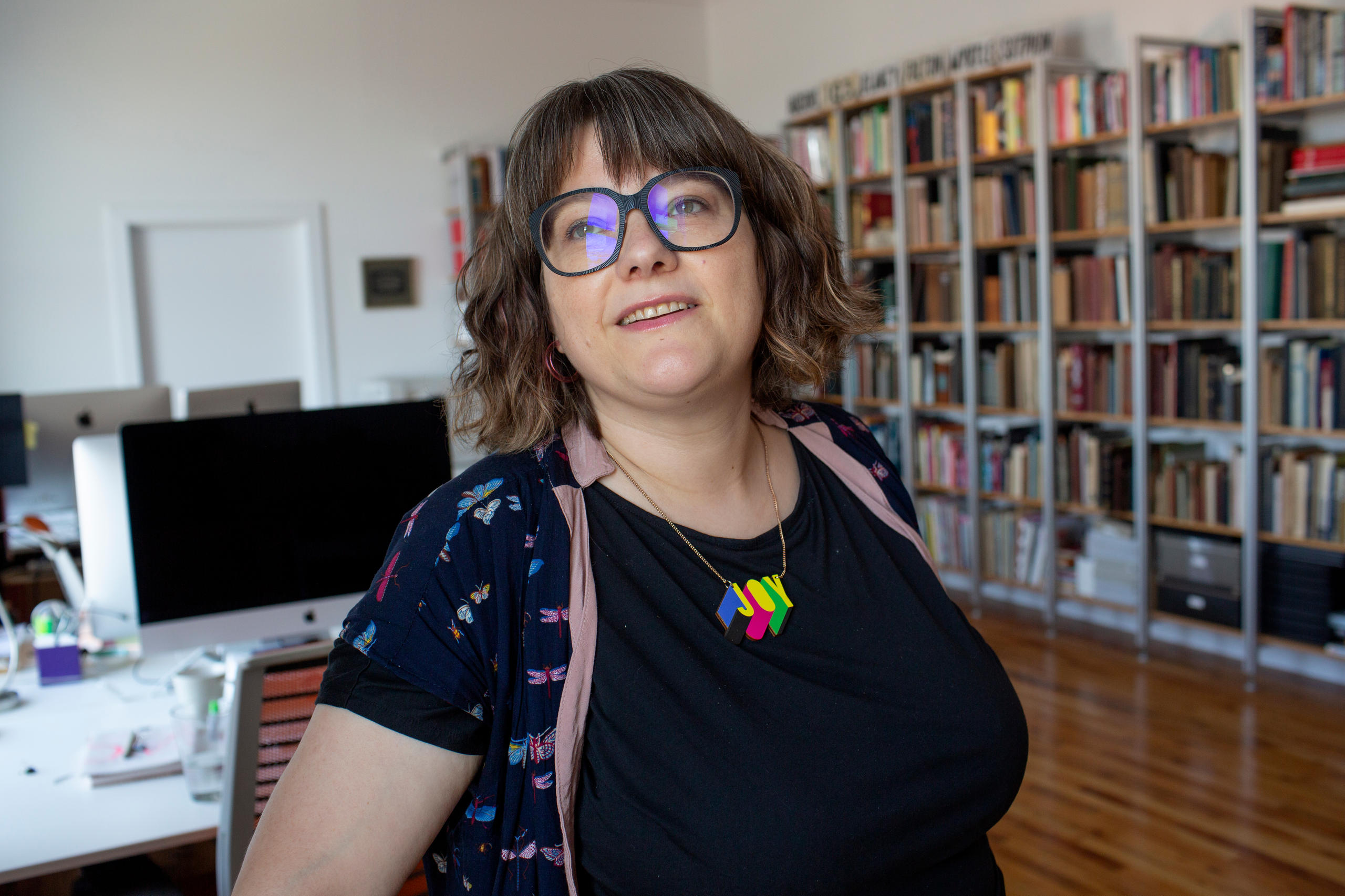
Where does a typeface designer find inspiration to create a new font? How is life in Brooklyn? SWI swissinfo.ch spoke to Nina Stoessinger, a Swiss typeface designer and lecturer in New York.

SWI swissinfo.ch: You design new fonts, like one of the contenders for the new standard typeface for Microsoft. What inspired you to get into typeface design?
Nina Stoessinger: I had a very circuitous path to typeface design. For a long time, I didn’t know that this was a profession. I actually wanted to be a journalist at first. Text was always the thing I was interested in. My dad is a stage actor and my mom is a writer, editor and journalist. So growing up, texts and books were always important in my family.
I always wanted to live in New York.
At some point, I realised how much I like design, so I went to study multimedia design in Germany. And then in my first semester there, we had an introduction to the proportion of Roman capital letters and we drew them on paper. And I just fell in love. I was taken with the thought that this is the interface between form and language and storytelling. For me, that was the hook.
SWI: How did you get to where you are now?
N.S.: I took a postgraduate type design course at Zurich University of the Arts. A few years later I closed my own design studio for a year and got an M.A. in typeface design from the Royal Academy of Art in The Hague which is one of the few places worldwide where you can get a degree in typeface design. I found typeface design to be a pretty complicated discipline to get into. Now I’ve been doing this full time for about five years at Frere-Jones TypeExternal link [a font design practice in New York].

SWI: How was it for you to move to New York and start a new life there?
N.S.: I always wanted to live in New York. This is my favourite city in the world. But moving here was also harder than I thought it was going to be. I had visited New York before, and I had friends here. I had a job lined up. So I thought I knew what I was getting myself into. But just the reality of living here in such a fast-paced environment, in a big city like New York, is a lot more intense than my life was in Switzerland.
But the thing is that, when you’re in a big city such as New York, the neighbourhood you live in is where your ties are. You know the people, say hello, have a chat. I go to the same store and the same bars all the time. You build your little ecosystem and especially out here in Brooklyn, it doesn’t really feel overwhelming. Going into Manhattan from Brooklyn, now that feels like a trip to New York! I love the city, especially now that the life and vibrancy have returned.


SWI: Is the city an inspiration for your work as well?
N.S.: Absolutely. Letters are everywhere around me here!
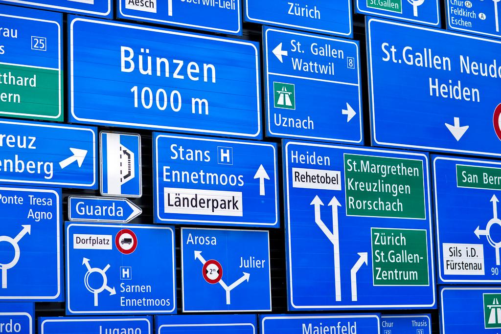
I spend a lot of time just looking around at all the signs, the graffiti, and all the various forms the letters have that cross my path. It is very interesting to me here that there is such a large variety of polished, “professionally made” lettering and signage here. And then, on the other hand, there are some things that are just very rough… a sort of extension of the hand lettering tradition. And then of course there are unexpected places like garbage trucks and oil trucks that are also very inspiring.
But I guess that’s still the kind of shift from just moving somewhere else, and then everything looks different. Now when I go back to Switzerland, I’m noticing things I haven’t seen before just because I was too immersed in them.
SWI: Is there such a thing as a “typical day in the life of a typeface designer”?
N.S.: It depends on what stage of the process of designing a new font we’re in. Right now, I’m sketching some new typefaces which means that I spend my time actually drawing. When you’re drawing a typeface, it’s basically a back and forth between drawing the letters individually and then you need to test them, print them out to see things in context and to see what actually works. The other part of my work is more technical, where the fonts need to be produced in all the different formats for our clients to use.
And I also teach a type design course at Yale School of ArtExternal link. I alternate semesters with Tobias Frere-JonesExternal link, our design director. He’s been teaching the class for a long time, and it was always overrun. That’s been very gratifying—especially because it was so hard for me to find out about this profession—to be able to pass it on to new folks who are interested.

SWI: If you come up with a new design, how do you set it apart from all the other fonts that already exist?
N.S.: If you design a font for continuous reading, the challenge is to make it not stand out too much. Otherwise, it will be distracting for the readers. And that’s quite difficult. It’s also, I think, a reason why many of those serif text fonts often look quite similar to the untrained eye.
On the other end of the spectrum, when you’re making something for a headline or a poster, that’s just a small amount of text in a larger size, then it can be much more creative.
Fonts are “the clothes that words wear”
There’s a historian called Beatrice Warde, who coined the expression that fonts are “the clothes that words wear”. I often have students worrying about a typeface being boring and that they need to inject their personality into it. The thing is, it’s going to happen anyway because you’re you and you have your unique set of inspirations and inputs that you carry around and bring to this task.
SWI: And when you have your new family of fonts ready, how do you find a name for it?
N.S.: We have a whole set of criteria that we think of when looking for a new name.
One thing that we try to do is to pick a name that looks good in the typeface itself. So ideally, you want to have a word that shows off some of the important key letters that exemplify the design, for example a capital “G”.
As for where the inspiration comes from, I often try to think of what a certain design reminds me of. So for example, if this was a physical object, what would it be made of? Some typeface pieces feel like they’re made of old wood or metal, and that can be a jumping off point to find a name.
In the case of Seaford, which was the one that we made for Microsoft, the process was easier because they had a briefing for the working title, to use a place from the Pacific Northwest. So, we just put together this huge list with all the place names and then we filtered it by length and how the words sounded. We ended up with “Seaford” because it seemed generic and at the same time it has a nice ring to it and is easy to remember and pronounce.
SWI: When will you know whether Seaford will be chosen as the new standard font for Windows?
N.S.: Probably in 2022, but at the moment that’s hard to say. They’re currently collecting user feedback, the fonts are already available in Microsoft Office. We’ve gotten some feedback too, so we made some additions and changes.
SWI: Do you have a favourite font?
N.S.: There’s a joke amongst typeface designers that if you ask a us anything, the answer will be “it depends”. And in this case, the correct answer would be I don’t have one favourite font, because it depends on what I would recommend it for.

But there are typefaces that stand out in my mind as being great feats of craftsmanship and creation, and one of those is a very old typeface. It was invented by Nicholas JensonExternal link in 1470. So that’s not long after [Johannes] Gutenberg invented the printing press with movable letters that look very old to us. And then along comes Nicholas Jenson and creates the first Roman typeface. And in terms of the proportions and in terms of the balance of the shapes, it seems completely plausible even today, half a millennium later, and that is no small feat.

In compliance with the JTI standards
More: SWI swissinfo.ch certified by the Journalism Trust Initiative

Join the conversation!