


Flicker, form, future: how Swiss design learned to move
From painstaking frame-by-frame films to modern interfaces, a New York exhibition brings to life pioneering films from the Basel School of Design, linking analogue experimentation to today’s visual language.
On the 19th floor of a Lower Manhattan high-rise, the word EAU in white block letters flickers across a black screen. Across from it, H2O flashes in black against a white backdrop. Ambient music drifts through the space as visitors linger before the projections.
The exhibition Frame in Frame – Swiss Design in Motion, was presented last month as part of NYCxDESIGN by the Swiss consulate-general in New York. It offered US audiences a first look at a lesser-known chapter of Swiss design history; one that helped shape the development of motion design.

Against sweeping views of the East River and the city’s skyscrapers, a multi-channel video and audio installation shows more than 200 rediscovered experimental short films created at the Basel School of Design between the late 1960s and 1990s. Motion design, which animates graphic elements like text, images, and interfaces, has become a defining visual language of the digital age. Yet many of its underlying ideas were already being explored decades earlier in the films shown across the installation.
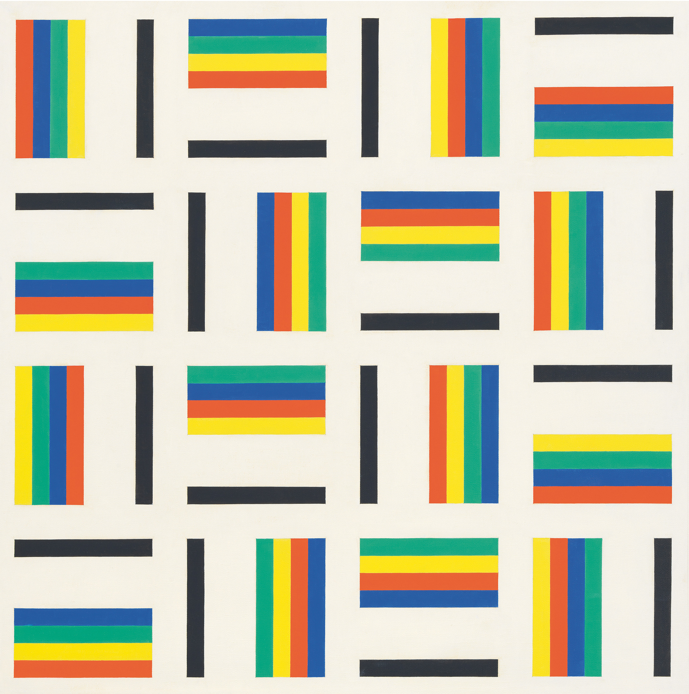
The exhibition both reflects and expands on conventional ideas of Swiss design, such as “modularity, right angles, no ornaments, pure design, straight lines,” says the curator, Christian Herren. “We wanted not to break that image, but to add something new to the story.”
Rather than present the films in a fixed, linear way, Herren worked with a team of artists and designers to create an immersive installation combining film projections, light, sound, and iconic examples of Swiss furniture and design.
Bringing together works from different eras, the exhibition connected past and present while highlighting the relationships between graphic design, moving image, and product design. To realize the project, Herren collaborated with the artists Daan Couzijn and Julia Schäfer, the designers Ben Ganz and Panter & Tourron and included furniture by Vitra, USM, Ruckstuhl, and Lehni.
Time is frame
The films were made by students on the Basel School of Design’s pioneering film and design course, which began in 1968 at the initiative of Armin Hofmann and was later developed and led by Peter von Arx, both key figures in Swiss graphic design. The programme was among the first to approach moving image through a graphic design lens, responding to television and emerging electronic media at the time, and is often seen as a precursor to what is now called motion design.
The course applied principles associated with Swiss design to the moving image, treating typography, rhythm, and sequence as constructive elements rather than narrative devices. Students were trained to think in terms of the frame and its organisation in time. The resulting films feature flickering sequences of images, minimal shifts, and overlays of colour and form, from black-and-white buildings in motion to swirling tree canopies and red parting lips.

“We were very touched with how contemporary they can be and how much the films also echo the time we’re living in,” said Herren.
To create the films, von Arx explained in an interview, students first developed visual templates, such as typography or grid structures, and then used a “score” to help map out how those elements would alternate, shift, or transform over time.
Working with a film camera, they then photographed each frame one by one in a painstaking process, not seeing the finished work until the film was projected and the sequence finally came together as movement. “The educational objective of this programme within graphic design education was creativity: designing without yet knowing the result,” said von Arx.
Decades later, the films were rediscovered in 2012 as the school prepared to relocate, von Arx said. Over two or so years, he and his colleagues reviewed the collection and decided which materials to keep. The surviving archive totals 27 hours of projection time. The films were preserved and digitised with the support of Memoriav and the Basel University of Art and Design FHNW and are now accessible to the public.External link
“Thanks to this digitisation effort, the films can still be viewed today,” said von Arx. “More importantly, they remain capable of generating the unique and surprising optical experiences that they produced when they were first created.”
A reaction to propaganda
Swiss motion design developed out of Swiss graphic design traditions in the mid-20th century. The work of designers in the 1950s and 1960s, which came to be known internationally as the “Swiss Style,” was characterised by pared-down visual design, relying on photography and graphic symbols instead of illustrations, limited colour palettes, sans serif fonts such as Helvetica, and use of the grid system and clean and asymmetrical layouts.
After the Second World War, Swiss graphic designers increasingly sought an objective approach to communication, explained Michael Renner, professor of visual communication at the Institute Digital Communication Environments, Basel Academy of Art and Design FHNW. The aim was to make visual messages that inform rather than seduce or persuade the viewer.
“This emphasis on objectifying visual messages was, on the one hand, a reaction to the experience of propaganda and, on the other hand, an effort to establish graphic design as a discipline distinct from art,” he said.
These ideas were later extended into moving image and have continued to shape motion design, evolving from early film animation to video technology and, more recently, digital platforms and social media. Today, motion design is ubiquitous, guiding users through apps, websites, transit systems, advertising campaigns, and more.
“The rise of corporations, the expansion of the film industry, and the increasing need to explain a world that was becoming ever more complex all contributed to the significance of Swiss motion design as part of the broader tradition of Swiss graphic design,” said Renner.
The film and design course at the Basel School of Design also contributed to this influence, attracting students from around the world. Many returned to their home countries and carried elements of the Swiss approach into their practices.

Among those associated with the school are designers such as April Greiman, Philip Burton, and Terry Irwin. Another former student is American multidisciplinary artist and activist Marlene McCarty, who went on to create film title sequences for movies including “American Psycho,” “Hedwig and the Angry Inch,” and “Velvet Goldmine.”
“When you look at the list of students who were there and what they do now, you have fine artists, you have graphic designers, you have filmmakers, you have camera people, you have title designers, and you have some architects who apply these techniques to create models. It’s very, very broad,” said Herren.
There are no current plans to present the exhibition elsewhere, but Herren hopes the films will resonate beyond their New York City run and continue to spark curiosity about Swiss motion design.
He said he hopes visitors will leave with an interest in the work. “Maybe they go read about it. Maybe they go to the online archive and can use the materials at some point. Maybe it will inspire them.”
More
From Dada to Concrete Art: when Zurich was a modernist battleground
Edited by Catherine Hickley/ds

In compliance with the JTI standards
More: SWI swissinfo.ch certified by the Journalism Trust Initiative
You can find an overview of ongoing debates with our journalists here . Please join us!
If you want to start a conversation about a topic raised in this article or want to report factual errors, email us at english@swissinfo.ch.